
You probably know that I’m a big fan of slope charts. And dot plots. Big fan. Love them both. But neither are default chart types in Excel, which, believe it or not, is still the primary data visualization tool for most of the world (I have no data to back that up, but I’m telling you it’s true).
Yesterday, Stephanie Evergreen published a post about how to make a lollipop graph using Excel 2013. If you’re not familiar with the lollipop graph, it’s basically a bar chart except that the end of the bar is replaced with a dot (the candy) and the bar itself is replaced with a line (the stick, if you will). (Alternatively, you might think of it as a dot plot with only one dot and the lines all stretch to the axis.) The lollipop graph reduces a lot of the ink on the page and I think helps the reader focus just on the end where the data are encoded.
Stephanie’s approach to making the lollipop chart in Excel 2013 was to create two scatterplots, one for the points and another for the labels, which were then manually edited one at a time. I use that general approach when I create dot plots in Excel, but I don’t manually insert and edit the labels; that, however, is a post for a different time.
In this post, I want to show you an alternate way to make a lollipop graph. I’ll use Excel 2013 here, but the approach is basically the same on all modern versions of Excel. I’m also going to use the same data Stephanie used in her post.
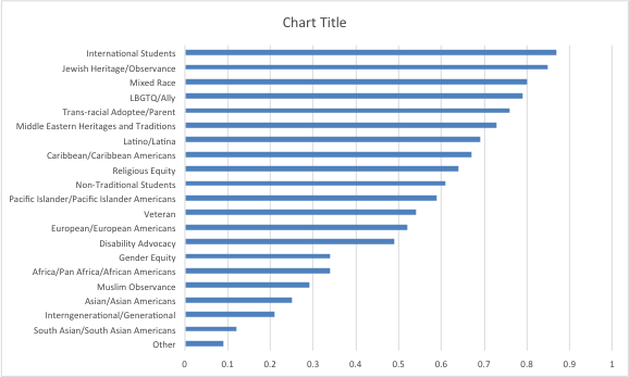
We’re going to start by creating a simple bar chart.
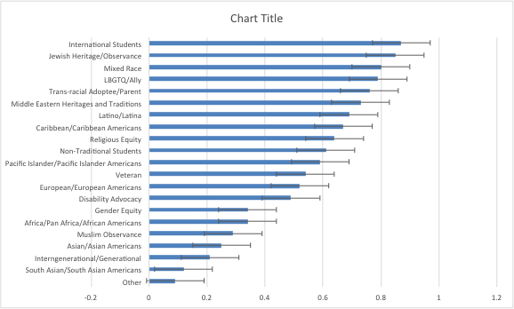
Now select the bars and add error bars (select the Error Bars option in the Chart Elements menu). In a bar chart, you are only able to add horizontal error bars, so you get the standard-looking thing with an error bar above and below the end of the bar.
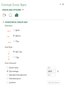
Now we’ll format the error bars: In the Format Error Bars menu, select the option for “Minus”, “No Cap”, and set “Percentage” in the Error Amount menu to 100%.
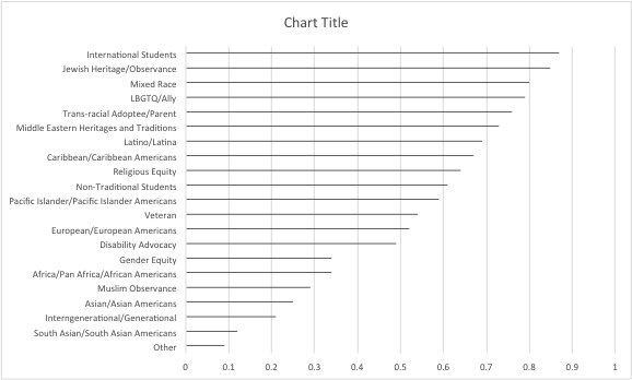
When you set the fill on the bars to No Fill you end up with horizontal lines.
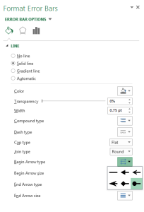
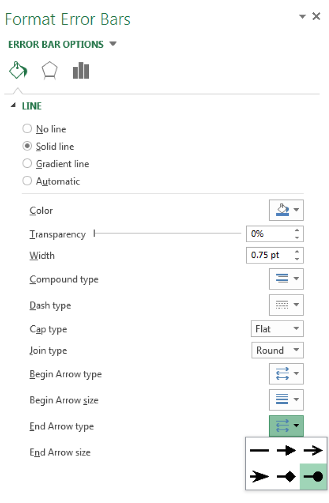
We just need to format the error bars to look like lollipops. So, again in the Error Bar Format menu, set the Join Type to Round and the Begin Arrow Type to the circle (it’s worth noting that Excel 2011 flips what begin and end represent). You can then choose the circle size in the Begin Arrow size menu. You can also change the color in the Color menu in the same menu.
You can then add a title, and format the gridlines, x-axis labels, and y-axis labels as you see fit.

There you go, a lollipop graph. To sum up: (1) build a bar chart; (2) add an error bar; (3) format the error bar with a circle at the end. No need to add another series and edit the series names one at a time. The primary downside of this approach is that the line and the dot are forced to be the same color. But the upside is that this is a much faster approach than creating two scatterplots and editing the series labels by hand.
(Oh, and I should also note that there is an even faster way to make a lollipop using the REPT and & functions, but those are created in the spreadsheet, not as a chart object. Perhaps a separate post? Let me know in the comment box.)
An extension…
The original draft of this post ended here, but Stephanie’s post and this post on dot plots from Jon Peltier got me thinking: Could you use this method to create a dot plot? Turns out you can. All you need is to calculate the gap between the two series you want to plot and use that as the length of the error bar. You never even plot the second series!
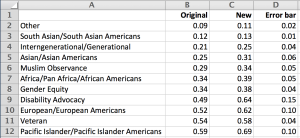
Let me show you. Here, I’ve added a second series–imagine it’s one year and then another year–and I then calculate the gap between the two (the “Error Bar” series).
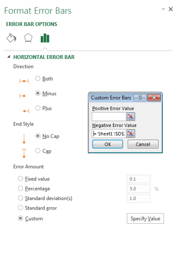
Selecting the error bars in the lollipop graph above, I go back to the Format Error Bar menu and instead of using 100% in the “Percentage” box, I use the “Custom” box and insert a reference to the “Error Bar” data series in the Negative Error Value box.
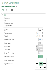
In addition to having the Begin style set up as circles, I now change the End style of the error bar to the circle as well.
That left end of the line now has a dot, which looks like I’ve plotted the other data point, but I’ve actually only used an error bar.

Now, this is a pretty decent dot plot in Excel, though there are two things I might like to change. One, I can only easily add data labels to the dot on the right side; I can’t do so with the left side. Second, I might like to have the y-axis labels next to the dot on the left. Both of these can be addressed using a slightly different approach to the dot plot (and that approach will differ between Excel 2013/2016 and Excel 2010/2011). If you’re interested in seeing that approach, please let me know in the comment box below and I’ll write it up soon.
Here’s the Excel file if you’d like to play around.
What do you think? Do you have an alternative way to make these graphs in Excel?


Yes, how do you have y-axis label next to the dot on the left? would make it easier for the reader.
Great post Jon! For the label on the left you could add another series to the chart that is a bar chart. The values of the bars would be the value of the left dot. Change the overlap on the bar to 0%, format the bar to No Fill so it is invisible, and set the label position to Inside End. I think that would work on all versions of Excel.
Thanks, Jon. Yep, that’s the exact approach I use! I’ll write a post detailing the steps soon.
I’d use a second series which is another set of dots, and format both sets the same (or maybe not, if you want to clearly distinguish low and high). Then the error bar will have no balls on their ends.
Sorry, overlap on the invisible bar should be 100%.
Great job, Jon. Lollipop charts are underutilized, simply because they’re not available by default in Excel.
Here’s an alternative for that, plus a few more ideas what you can do with lollipop charts:
https://zebra.bi/lollipop-charts-excel/
Very elegant solution. I just applied it in a minute without modifying my dataset. Thanks Jon!
Hi! thank you very much for this post. It possible to change the color of end arrow type? and add the legend for each color?
Thank
Hey Roland,
With this method of using error bars, both end points and arrows all must be the same color. You could also add a legend by adding separate data series. You could create the same graph type using scatterplots (and bar charts, if you’re using versions of Excel prior to 2016), which would enable you to change the colors. Check out the step-by-step ebooks in the PolicyViz shop to learn how to use that approach.
Thanks,
Jon
I have found this very useful – better than other versions. I have also added gridlines behind the error bars, so that you can more easily see which category the dot plot is relevant to. Thanks for this!
Hi, thanks for this. I’d like to have just the dots and not the lines. Any way to do that?
I just figured out one way that kind of works for removing the lines. I simply set the error amount to 0.001% instead of 100%.
Instead of making the error bars -100% long, make them-1% or -0.1% long. The dots will hide the very short lines that result.
Oops, submitted my answer before I saw Amanda’s second post.
This is EXACTLY what I was looking for. Thanks for sharing this. It’s things like these that make you able to impress someone with an EXCEL graph. “Wow, what did you make that graph with???”
It’s just Excel baby! 😉