Last week, I spent an amazing day in New York City working with about 35 other awesome people discussing the ethical, security, and privacy challenges facing people working with data and creating data visualizations. The conversations at this Responsible Data Forum were amazing and the different kind of work people are doing–from helping to open government data to human rights campaigns to working with emerging technologies–were not only fascinating because of that work, but also because how these ethical issues face all of us.
We spent the morning doing some really interesting exercises (a topic I’ll cover in a future post) and thinking about the different ways responsible, ethical data use is important. We ended up with over two dozen categories including uncertainty, graphic literacy, data transparency, motivation, objectivity, and inclusion and culture. I was particularly interested in this last group of inclusion and culture, and spent most of the day working with a small group of folks thinking about the diversity challenges in data visualization (again, a future post–and a collaborate platform!–hopefully coming out in the next few weeks).
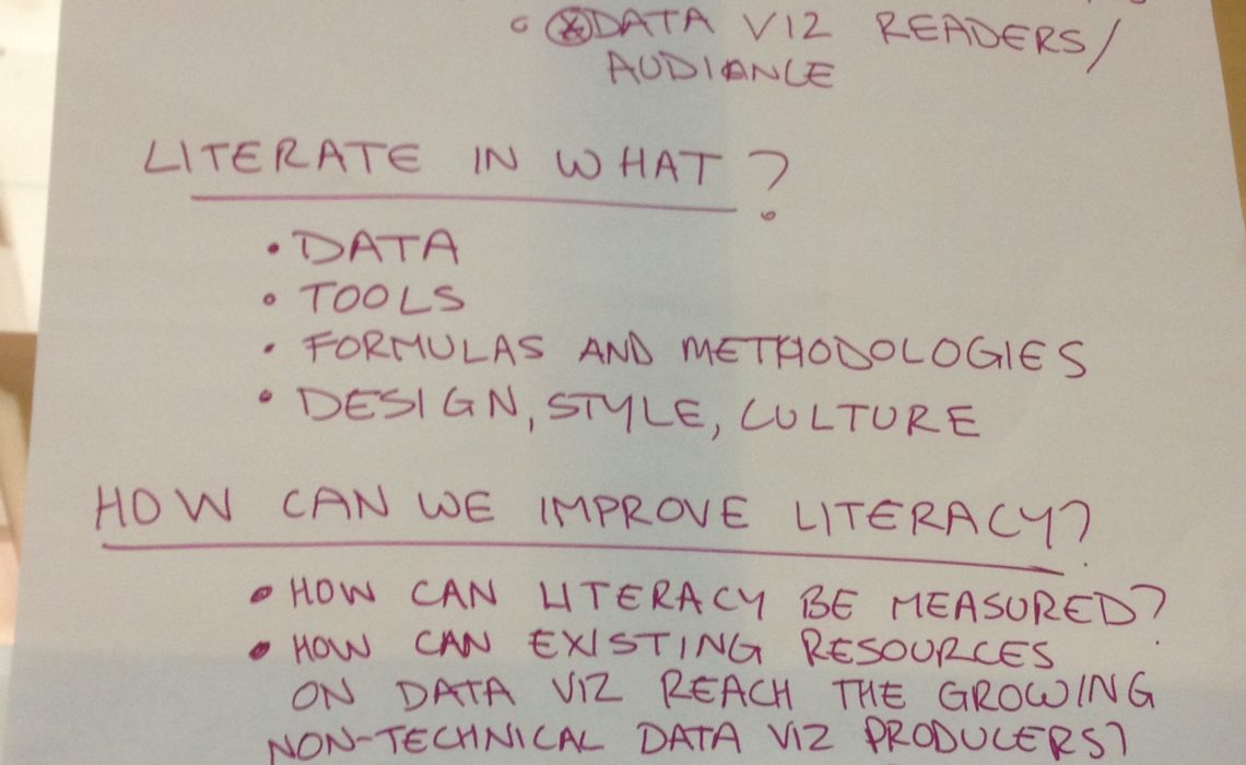
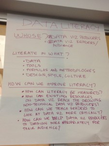
I also spent some exciting time talking with Noel Hidalgo, who is the Executive Director and Co-Founder of BetaNYC, the nation’s largest open government and civic technology meetup group. Noel was working in the Graphic Literacy group, and one of the things they were tossing around was a checklist or document to help individuals and groups improve their graphic literacy and create better data visualizations.
Anyways, Noel and I got to talking about how a collection of style guides might be a great resource for people. Going further, elements from those style guides could be distilled to create a checklist or guidelines for best practices, both with general style and data visualization more specifically. 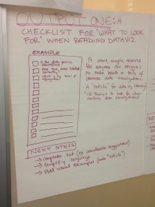
So today I’ve added a page to my website that I hope will be a clearinghouse for style guides. I’ve added three already, from the Sunlight Foundation, The Dallas Morning News, and the Urban Institute. These guides are primarily aimed at showing people in these organizations how to style their visualizations. They all include color palettes, some include specific layout details, and some include best practices. They are not necessarily data visualization “how-to” guides–there are lots of great books and blog posts for that. These are documents concerned with the style of visualizations and how to present them in better ways.
 I’m asking that you please use the comment section of the site (or hit me up on Twitter) to send in links to other style guides. Together, we can build a library of best practices that others can use for their own work.
Go to the Style Guides Page


Jon,
Gathering style guides is a great idea.
You might find this useful. I’ve used it as a starting point for teaching scientists how to communicate their research effectively:
http://threestory.com/content/downloads/Design%20Chi%20-%203%20Keys%20to%20Compelling%20Communications.pdf
Here’s a brief blog post about it too: http://threestory.com/blog/three-keys-to-compelling-communication
Erik