Sometimes a table is preferred to a graphic.
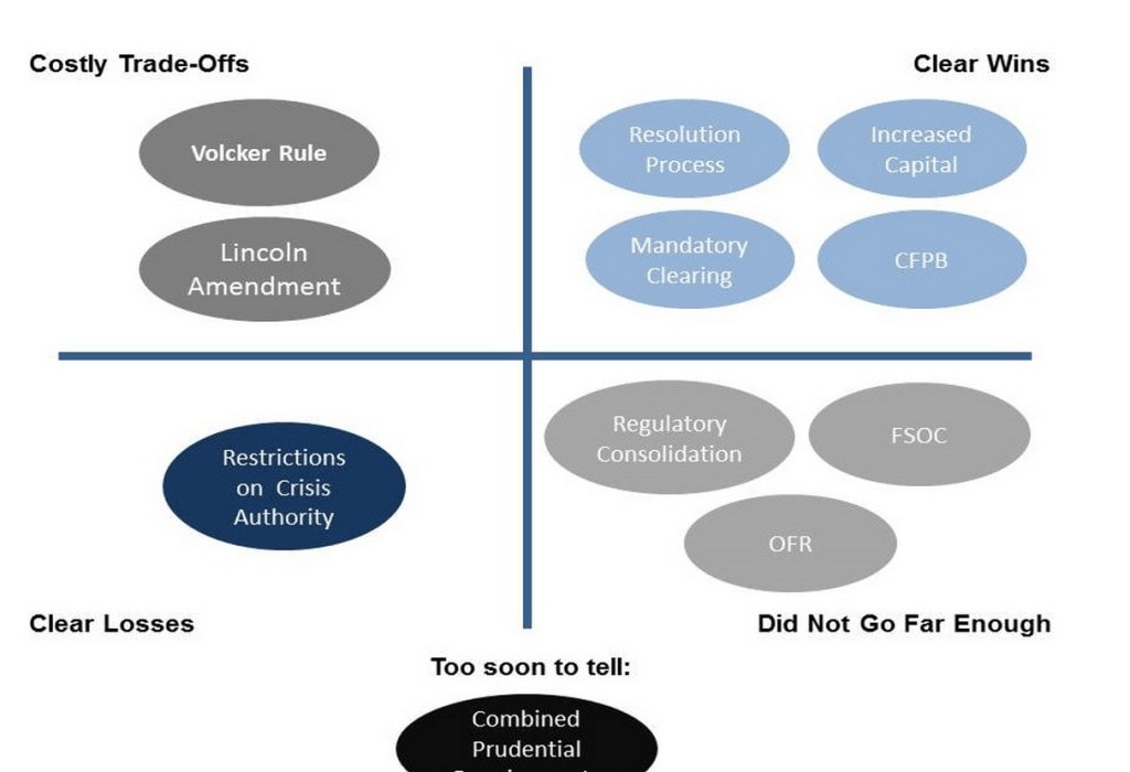
A recent blog post from the Brookings Institution included a reprint of this graphic from Martin Neil Baily (Brookings) and Aaron David Klein (Bipartisan Policy Center). The graph is taken from a recent conference presentation in which the authors examine the impact of the Dodd-Frank Wall Street Reform and Consumer Protection Act law.
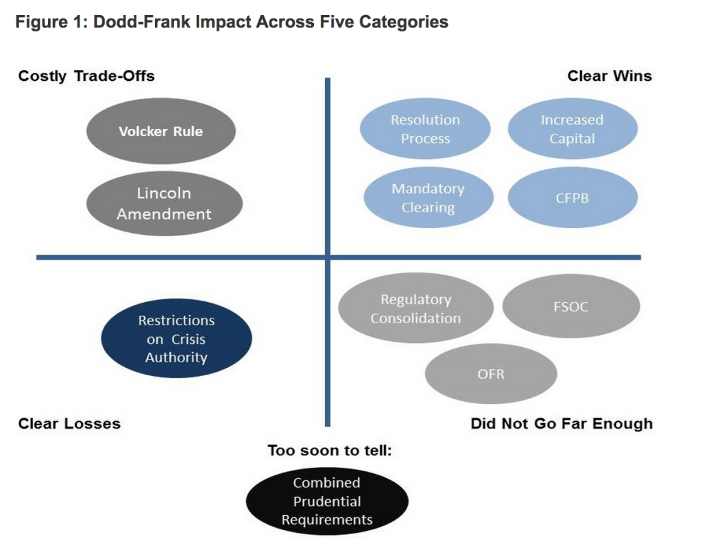
In their presentation, Baily and Klein divide the Dodd-Frank provisions into 5 categories. The graphic summarizes their analysis by showing, for example, that they consider increases in bank capital and mandatory clearing “clear wins” and restrictions on Federal Reserve lending “clear losses”.
When I first looked at this graphic I thought I was looking at an X-Y plot in which each axis was showing a range from, say, “clear losses” to “clear wins.” The ovals further suggested some kind of scatterplot chart. Upon further inspection, however, it became clear that the horizontal and vertical axes acted as nothing more that separating the 4 categories and the circles were simply being used to highlight the eleven categories.
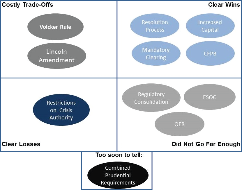
This is just a table forced into a graphic format. One quick fix I would make would be to create a box around the entire graphic, though I might go even farther and place the titles in the same position in each box. This feels more like a diagram and less like graph that suggests a range along the vertical and horizontal axes.
But why take the graphic approach at all? Sometimes a table will serve your purpose. In the table I’ve made here, I combine the summary information shown in the original graphic with definitions of all 5 groups (that was written in text in the Brookings blog post).
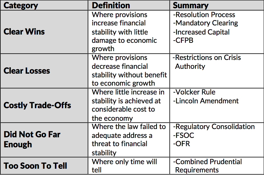
In this approach, there is no doubt that we are looking at different categories and I’ve combined the definition of each category with the summary information. It’s also the case that the table approach is more suitable for a blog post or written document than a presentation. In the original case of using the image for a presentation, maybe my earlier edit with the outer boundary would work, or maybe take this table and delete the middle column.
Perhaps the table approach is less visually appealing than the original graphic, but sometimes such visualtions distorts or misrepresents the content. In this case, the graphic suggested some relationships that simply doesn’t exist.


The new mam میگه:Hands down, Apple’s app store wins by a mile. It’s a huge selection of all sorts of apps vs a ratehr sad selection of a handful for Zune. Microsoft has plans, especially in the realm of games, but I’m not sure I’d want to bet on the future if this aspect is important to you. The iPod is a much better choice in that case.