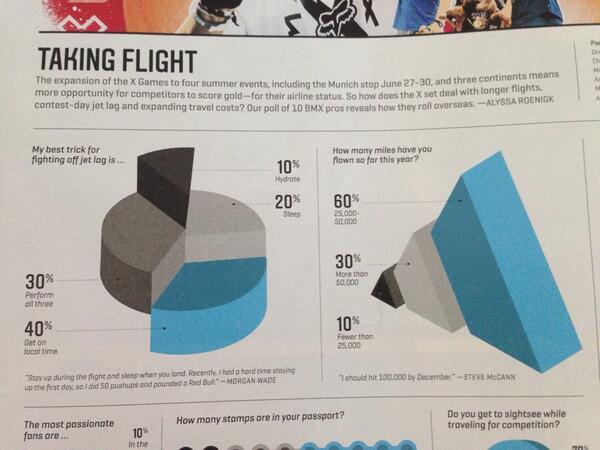
Expiring frequent flyer miles are a great excuse to get a magazine you might not otherwise buy. For as long as I’ve been receiving ESPN The Magazine, it’s been packed with lots of 3D graphics, crazy unit charts, and column charts that don’t start at the 0 axis.

But lately, the magazine has embraced better data visualization practices—less 3D; more column and bar charts; line charts with annotation; and annotated sports fields with encoded data.
This goes back to a key question: are more visually appealing graphics—but perhaps less perceptually accurate—better than those that follow data visualization best practices? Recently, Borkin et al, conducted an experiment to determine which characteristics caused visualizations to be the most memorable. (Robert Kosara and Enrico Bertini discussed some of their misgivings about the paper in this Data Stories podcast. Stephen Few also has written a critical review.)
I don’t think the lack of 3D pie charts and whatever that thing is above makes the magazine less visually appealing. Maybe it’s true that we are attracted to circles—we’re certainly attracted to different shapes, colors, and forms—but I don’t think the lack of those graphics is a detriment to its readers or a deterrent to future subscribers.
Not everyone has the same interest in the charts shown in the magazine. To better understand how the graphics impact overall readership, let’s assume there are four groups of readers:
- One group never reads the graphics—they are more interested in the stories and op-eds. Moving to data visualization best practices does not affect their enjoyment of the magazine. Overall impact: none.
- Another group reads and explores the graphics in conjunction with the text to better understand the story. Best practices will help them gain greater understanding though its possible some will find the graphics less interesting because the bells and whistles have been removed. Overall impact: uncertain.
- Another group reads and explores the graphics because they are data nerds—for the most part, this group will be better off with visualizations that more accurately present the data. Overall impact: positive.
- The final group only reads the graphics because they are visually appealing. Moving towards less visually striking images—say a simple bar chart instead of a 3D triangle—may in fact dissuade them from buying the magazine. Overall impact: negative.
It’s hard to say what the overall impact will be, but I’m guessing ESPN has investigated. It would be interesting to see what that data shows.
In any case, here’s hoping that they keep it up because my subscription expires in the Spring.


Data visualization is a relatively recent language. We’re still exploring. That’s why we see these failed experiments. Magazine layout is much more mature and that’s why we have widespread conventions that enhance the reader experience — titles larger than the text, usually at the top, paragraphs, tabs, images embedded, reasonable margins, etc. You don’t see paragraphs with eight different fonts, colors and sizes.
Readers of ESPN The Magazine are, I assume, mostly interested in sports, more so than flashy colors. Show them a good sports story — be it through text, tables or graphs — and they’ll read it without a thought about the format. If ESPN used these silly graphs to represent this data, it is perhaps because it’s irrelevant. Tips for fighting off jet lag, in a sports magazine? I don’t expect their audience to be interested and neither do they apparently They don’t even seem to have found anything interesting in the data. So they try to make it up with flashy images that do not show the data (including a 3D Adidas logo). I would expect that their sports graphs, something important and interesting to their audience, are much better. In fact, Edward Tufte always raves about their data presentation at ESPN.com.
tl;dr Content is king.